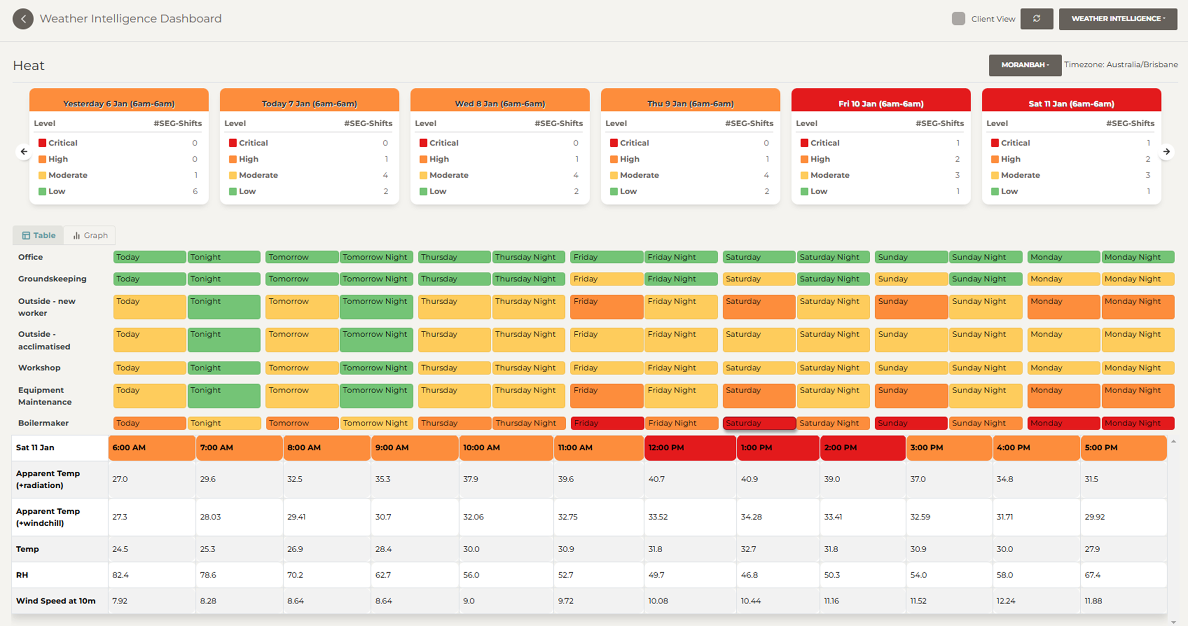
Kite’s SEG Heat Risk Dashboard is designed to help sites minimise the risk of heat-related illness via proactive risk management practices. The dashboard presents the forecast of conditions conducive to an increased risk of heat-related illness for each predefined SEG (Similar Exposure Group).
This is done using the hourly forecast of Apparent Temperature and calculation of the thermal risk (using the same methodology as the Thermal Risk Assessment) for every hour for every SEG for the next 6 days.
Use Kite’s Thermal Risk Assessment to identify the SEGS that require monitoring, and who would benefit from an outlook of heat risk over the coming week.
Dashboard Features
-
Cards showing daily:
-
Number of SEGS with Low, Moderate, High and Extreme heat risk.
-
Card colour based on maximum risk level for a shift.
-
-
Daily cards are presented for today, the last 6 days and the next 6 days. You can navigate by using the arrows.
-
Note that a “day” is taken from 6 am to 6 am. For example, “today” is from 6 am today until 6 am tomorrow. This is to correspond to most shift operations. If your shift start times are different you can request a customised dashboard.
-
Detailed hourly data can be seen as a table (select Table tab) or graph (select Graph tab). The tabs are located above the table/graph on the left-hand side.
-
If you have your weather station set up to send data to Kite this is shown in the table in bold and is presented on the graph as a solid line.
-
You can extend the data viewed on the graph by clicking the All button, located in the top left-hand side of the graph window. Additional variables can be viewed on the graph by selecting the Secondary Variables check box (located above the graph on the right-hand side).
-
The table shows the maximum risk level for the shift for each SEG. Click on a coloured shift cell to see hourly variables (temperature, humidity, apparent temperature and wind speed) as well as coloured heat risk per hour. This can be used to identify the timing and duration of the high-risk periods for each shift.

Risk Level Thresholds
The risk levels are as defined by the AIOH basic thermal risk assessment methodology with an explanation presented in the table below.
|
Alert level |
Interpretation of risk |
Actions |
|---|---|---|
|
No alert |
The risk of a heat-related illness is very low. |
Basic heat safety and planning. |
|
Low |
The risk of a heat-related illness is low to moderate. |
Basic heat safety and planning. |
|
Moderate |
There is a potential for heat-related illness to occur if the conditions are not addressed. |
Implement precautions and heighten awareness. |
|
High |
The onset of heat-induced illness is likely. |
Implement additional precautions to protect workers. |
|
Extreme |
The onset of heat-induced illness is extremely likely. |
Consider the need to work or implement even more aggressive protective measures. |