Kite’s Map View Dashboard allows you to see observations from now back to 1 hour ago on a map, so you can visually see how the weather is developing.
This dashboard is only available for feedlots located in Australia, as it uses radar data from the Australian Bureau of Meteorology (BOM).
The observations you can view include:
-
Live lightning strikes (certain Premium subscription organisations only)
-
The BOM’s rain radar
-
BOM weather warnings
-
Temperature from BOM weather stations
-
Rain since 9 AM measured at BOM weather stations
-
Wind speed and direction from BOM weather stations
Using the Dashboard
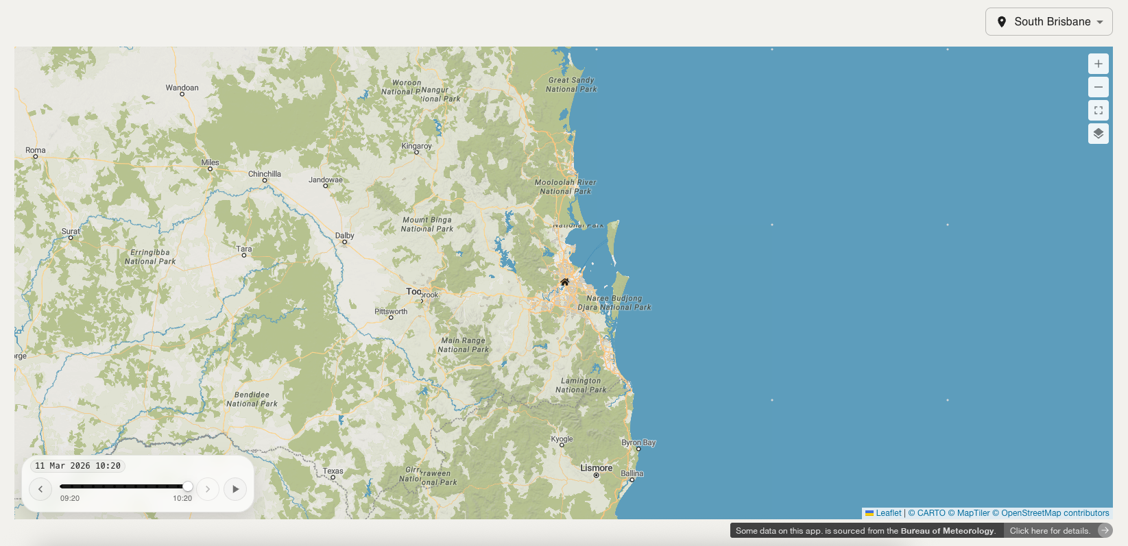
1. Choose a feedlot
Use the dropdown in the top right-hand corner of the page to select a feedlot. The map will be centred on the chosen feedlot, which will be marked with a home icon.
2. Select map layers
Click on the Map Layer button in the top right-hand corner of the map. It looks like this:

The map layers menu will appear as shown below:
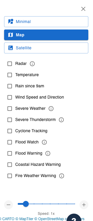
Select as many map layers as you would like to view, by clicking on the checkboxes next to them. To see the colour legend for a map layer, click on the
There are 4 categories of map layers available:
Lightning
Live and recent lightning strike locations, including strikes from cloud-to-cloud and cloud-to-ground.
These layers are only available for Premium subscription organisations with lightning data set up in Kite. Please contact us at support@weatherintelligence.global if you are interested in this feature.
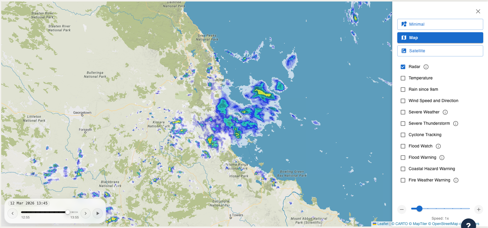
Radar
Displays data from the BOM’s rain radar network.
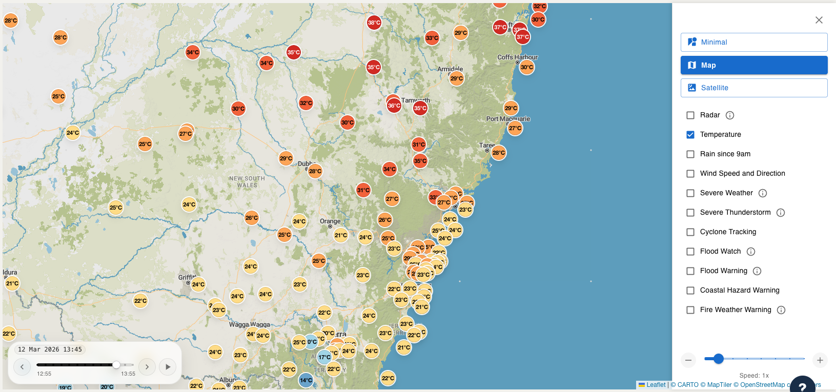
Observations
Displays data from the BOM’s weather station network. This includes measurements of Temperature and Rain since 9 AM (displayed on the map as numbers in coloured circles), and Wind Speed and Direction (displayed as coloured arrows).
Warnings
Includes severe weather, severe thunderstorm, cyclone tracking, flooding, coastal hazard and fire weather warnings. Each warning is displayed on the map as highlighted areas, using colours according to their legends.
3. Select map settings
In the map layers menu, as shown above, available map settings include Map Type (minimal, map or satellite), and Animation Speed (0.5x to 4x). You can change these to whatever you would prefer.
4. View your animated map
The layers you selected should now be visible on the map.
In the bottom left-hand corner of the map, you can see what time is currently being displayed. Select the play button ▶️ to see the observations change over time, at your selected animation speed. You can also drag the point on the timeline or click on the arrows on either side of the timeline.
You can close the map layers menu with the X button in the top right-hand corner. You may then notice the other buttons in the top right-hand corner of the map. The + and - allow you to zoom in/out, and the third button makes the map full-screen. You can adjust the map however you like.

5. Experiment!
Repeat these steps to view different feedlot locations, map layers, map types and animation speeds, to see which ones are most helpful for you!