Kite’s Data Management Dashboard allows users to view and download any of their organisation’s weather data on Kite. This includes both forecast and observed variables, up to years in the past and about two weeks in the future.
Organisations can use this dashboard for their own analytics and reporting, as it helps to identify trends and relationships in the data.
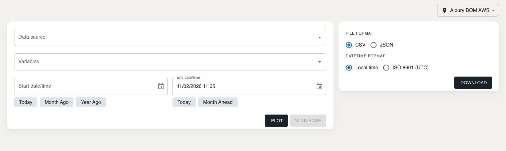
To use the dashboard:
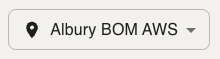
1. Choose a feedlot
Using the dropdown in the top right-hand corner of the page.
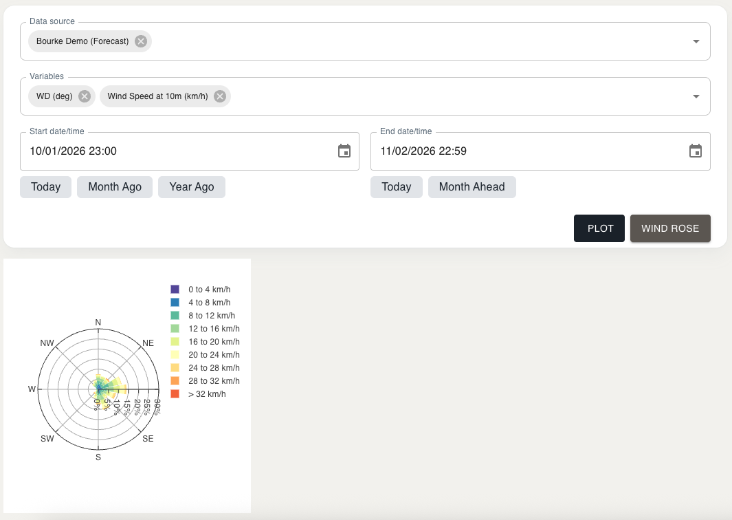
2. Select data sources
The Data Source dropdown will show you all data sources that are available for your chosen feedlot. You can select as many data sources as you’d like.

3. Select variables
The Variables dropdown will show you all variables that are available for your chosen data sources. You can select as many variables as you’d like.

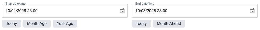
4. Specify dates
Enter in a Start Date/Time and End Date/Time. You can also use the buttons below to quickly fill these fields with certain dates (such as today, one month ago or one year ago).
5. Plot your data
Select the Plot button to view your data, or Wind Rose if it is available.

Note the Wind Rose option is only available when the variables ‘Wind Direction’ and ‘Wind Speed at 10m’ are selected. These may not be available for most feedlots.
After plotting your data, you can view it as a graph or table. You can switch between these views using the Plot and Table tabs.
“Plot” View
In the “plot” view’s legend above the graph, forecast variables are labelled with (FC) and observed variables are labelled with (OBS).
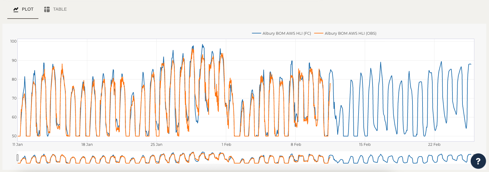
In the “plot” view you can hover over the graph to see exact values, and click and drag to zoom into specific sections. Double-click the graph to return to its original view.
You can also click on variables in the legend to hide them on the graph, or double-click a variable to isolate it.
“Table” View
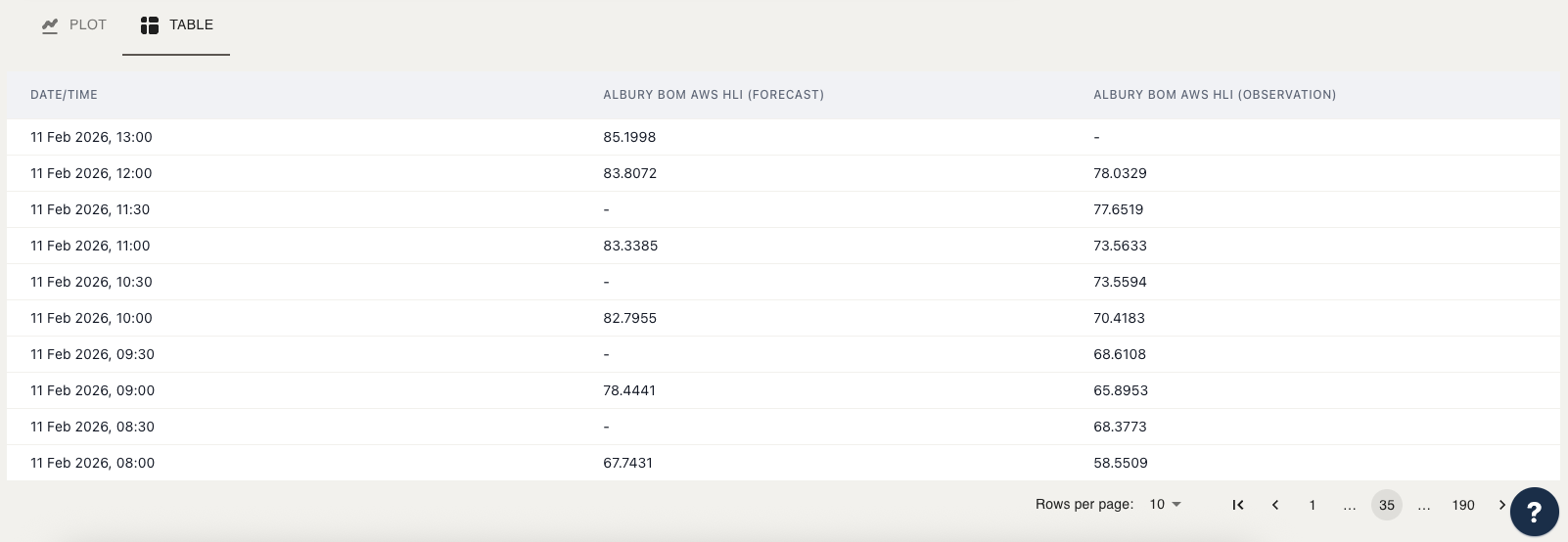
By default, the table shown is sorted by date/time from newest to oldest. To change this, you can select a column title to sort by that column in different orders.
There may appear to be some data points missing because different variables can be recorded at different frequencies/times of the day.
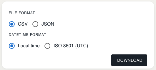
6. Download your data
To the right-hand side of the Plot section, you can choose your preferred download options (file format and datetime format), then select the Download button. This will allow you to download your selected data for your own use.